UX Design
Duration
Aug 2025 - Nov 2025
Role
Product Designer
Team
Group of 3 designers
Tools
Figma, FigJam, Balsamiq

🌊
User research
How are users currently navigating through the flood preparedness process?
To gain a better understanding of current users' perspectives and experiences when preparing for floods, we conducted an online ethnography on Reddit and Facebook. Here, we identified a few key insights that influenced our design goals.

Online Ethnography
Reviewed flood-preparedness conversations and behaviour across Reddit and Facebook.

Preparedness
Identified poor preparedness, missing emergency plans, and low uptake of flood-safety actions.

App Reviews
Evaluated alert, weather, and first-aid tools to identify gaps in flood-specific guidance.
Persona
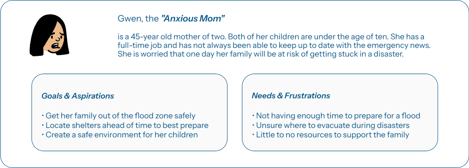
After analyzing our user research, we developed the following user personas to capture our target user groups.
The personas capture a new homeowner anxious about risk, a parent trying to keep a family safe, and a student with little flood experience. Their needs informed a beginner-friendly, well-structured preparedness experience.


User flow
The user flow outlines the steps users take to find nearby shelters when located in a high-risk flood zone.
I want to simplify the process of finding shelters and avoid overwhelming users with unnecessary information.

LOW-FI WIREFRAMES
To create my low-fi wireframes, I utilized Balsamiq to design key functional elements based on the user flow created previously.
Here, I prioritized mainly on the functionality and information hierarchy rather than visual design, as I am directly translating the steps users take to find nearby shelters onto my screens. Main screens created include, map tab home page, next steps, shelter list, shelter information, and navigation.
Map Landing Page

✔
Full display of maps for visibility, including warning labels for high risk zone
✘
Icons were confusing, and users were confused about the type of hazard that is occurring
High Risk Zone Options

✔
Half-screen display allows users to view their current location status, as well as navigating through options
✘
High risk zone warning banner could distract users from navigating through their next preferred action
Flood Pop-Up

✔
Allows for less commitment as users can easily exit if they need to select another action button
✘
Popups are generally not used in this way and could confuse users
Nearby Shelters

✔
Filter selection that allows users to sort through the type of result they want to see
✘
Icons are confusing as it doesn't pinpoint the exact hazard that is occurring. Map search bar could also be removed as it is unnecessary during this course of action
Shelter Information

✔
Shelter location is listed with a task-specific label. Underlining the text indicates that it will lead to navigation
✘
Need action buttons as next steps might not be as intuitive
Navigation

✔
Container displaying user's destination and the amount of travel time. Minimizes user's memory load as information is readily available
✘
The map should be in bird's-eye view to match other map apps that individuals are already used to
FINAL DESIGN
After many iterations, we present FloodReady (specifically on locating shelters page).


View Flood Risk Level & Determine Next Steps
Stay safe and protected by assessing the flood risk level of your current location. As well as determining next steps if you were to be located in a high-risk zone.
Locate Nearby Shelters & View Relevant Info
Stay prepared ahead of time by finding nearby shelters in case of an emergency. Sort by preferences to determine the best-fit shelter and view relevant information to stay informed.


Easy Navigation To Chosen Shelter
Route to preferred shelter through FloodReady's integrated maps and direction guidance system.
FINAL DESIGN
After many iterations, we present FloodReady (specifically on locating shelters page).


REFLECTIONS
This was my first project during my UX Master's course at the University of Sydney. I really enjoyed the whole design process from start to finish — from navigating through a new problem space and understanding my target group to designing a user experience that satisfies their needs. I also enjoyed the challenge of working with my group members to ensure our designs matched, especially since we were designing the same application for different device types. It has been truly a learning experience and I loved expanding on my Figma capabilities through this project.
If I had more time, I would have explored more features within the FloodReady mobile application. Some features that were present in my group members' tablet and watch devices were learning flood preparedness skills and timely alerts. I believe exploring the design of these two features for the mobile application would make FloodReady more robust and user-friendly.